PL / EN / DE
← All projects
Case study · Baumeister Stein GmbH

Branding for the Swiss construction market

Client
Baumeister Stein GmbH
Collaboration
2026
Scope
BrandingSocial Media
Branding for the Swiss construction market

Baumeister Stein GmbH is a Swiss renovation and construction company with more than twenty years of experience. For BMS we designed a complete visual identity system – from a new logo and fleet branding to social media templates.

01 · CHALLENGE

Breaking the barrier of “invisible” professionalism

On the Swiss market, trust is built slowly, and premium investors base their decisions on hard evidence of professionalism.

  • The problemDespite more than two decades of experience and top-quality services, Baumeister Stein GmbH remained practically invisible in the visual world.
  • The goalTo create a consistent image that communicates craftsmanship, precision and the Swiss standard “before the viewer reads a single word”.
02 · VISUAL STRATEGY

Präzision in Stein gemeisselt

We built our strategy on the Big Idea “Precision carved in stone”, a nod to a Swiss saying. The branding was to become a visual promise of excellence in which every detail matters.

Key pillars of the identity:

  • Trust through symbolism: A mark that builds the owner's authority as an expert who personally guarantees the quality of the work.
  • Transparency and clarity: An aesthetic that reflects order on the construction site and the company's technical expertise.
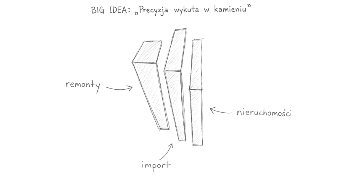
Big Idea “Precision carved in stone” – a sketch of the Baumeister Stein mark: renovation, import, real estate
03 · EXECUTION

A complete visual identity system

We built a system ready to scale across every communication channel.

ILogo redesign

We designed a strong, geometric mark that combines modernity with the craftsmanship of the industry. The logo was prepared in horizontal, colour and black-and-white versions for full versatility.

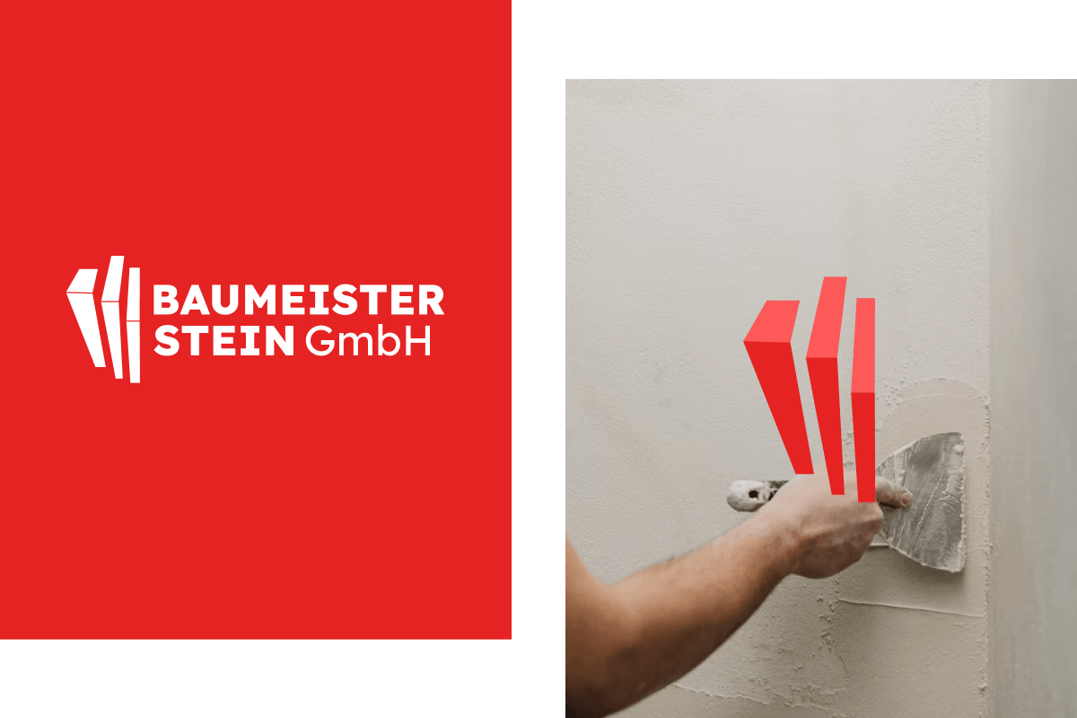
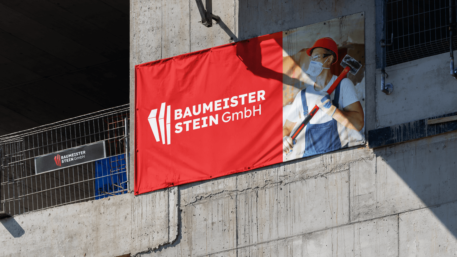
The new Baumeister Stein GmbH logo on red and the brand mark in a renovation context

IITypography and colour

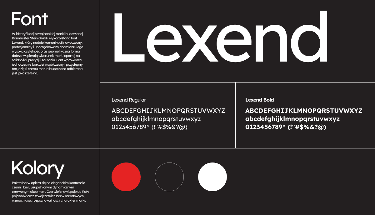
We chose the modern Lexend typeface (Regular, Bold and Black), which communicates stability. The palette is based on elegant black and white with a dynamic red accent (RGB: 229, 35, 35), a reference to the vehicle fleet and the Swiss national colours.

Lexend typography and the Baumeister Stein colour palette – black, white and a red accent

IIIFleet branding

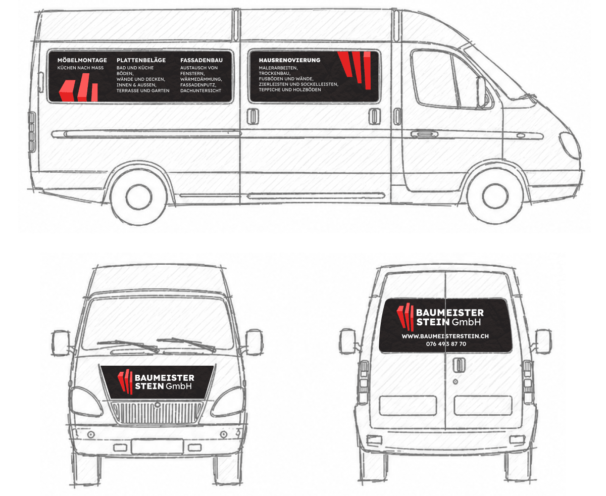
Company vehicles became a key advertising medium. We developed a complete vehicle livery that ensures recognition on Swiss streets.

Baumeister Stein company van branding – side, front and rear view

IVPrint and office materials

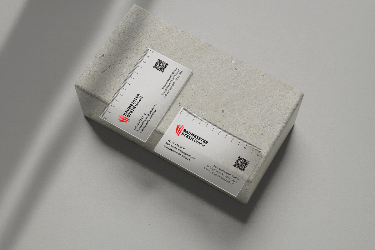
We designed minimalist business cards and a professional email signature, ensuring consistency at every client touchpoint.

Minimalist Baumeister Stein business cards with a ruler motif

VCommunication plan and social media templates

We made sure the new visual identity of Baumeister Stein GmbH carried over seamlessly into the digital world, creating a consistent ecosystem. Alongside the branding, we developed a comprehensive social media communication plan to position the company as a specialist on the Swiss construction market.

  • Diverse creative lines: We divided communication into strategic content pillars – from spectacular “before and after” results, through expert technical tips that build authority, to behind-the-scenes content.
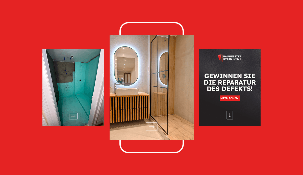
  • A dedicated template pack: We designed a set of original, fully editable post templates that keep the brand visually consistent on social media.
Baumeister Stein social media templates – a “before and after” carousel and a contest post
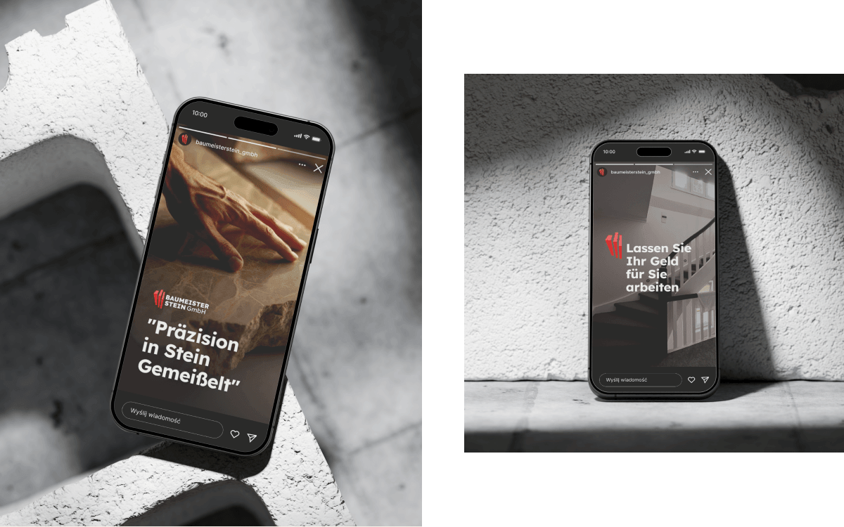
Baumeister Stein Instagram Stories on smartphones – “Präzision in Stein gemeisselt”
04 · RESULT

Branding that builds trust

The new visual identity immediately raised the brand's prestige in the eyes of current and prospective clients.

  • Measurable professionalisationThe company gained the image of a premium “all-rounder”, allowing it to position itself as a strategic partner for investment clients.
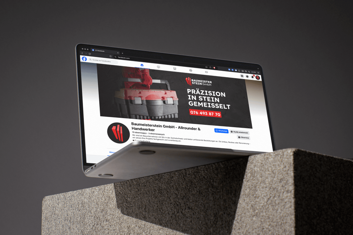
The Baumeister Stein GmbH Facebook page in the new visual identity
05 · CONCLUSIONS

Design as a business tool

The Baumeister Stein GmbH case study proves that on the demanding construction market, branding is not an add-on but the foundation for scaling a business.

  • Visual precision became digital and physical proof of the quality that previously only referral clients knew about.
  • A consistent system allowed the brand to step out of the shadows and become a recognisable player in the premium market, building its position as a partner of first choice.
Next projectWYŻSZA SZKOŁA PRAWA360° marketing in the service of educationRead the case study →
Your project

Want similar results for your brand?