



Corporate visual identity – why does a brand need more than a good logo?
Our latest collaboration with Mateusz Gębala's studio – Pracownia Gębala, hairdressing industry.
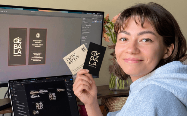
A good corporate visual identity doesn't have to mean elaborate branding from day one. At Brandkick we can start with logo design, a business card (printed or Google) or an email signature and build a base that grows with the brand into a coherent system.
But is a good logo enough on its own? How do you know an identity fits your brand and how do you keep it consistent across different materials? We collected the questions we hear most often from clients and answer them using our latest collaboration with Pracownia Gębala, the owner of a hair salon in Wrocław. We started by preparing a social media communication plan and posting updates about the studio's renovation, and the collaboration grew into comprehensive company branding – from the logo and key visual, through print materials and the salon's storefront, to ongoing social media communication.
Individual elements are not yet a system. You can have a good logo, an interesting colour and a great font, but if every piece of material speaks a slightly different language, the brand starts to lose its character. That was the case with the studio. It had no coherent company branding before, and the visual elements in use came from stylistically different worlds. Mateusz ran the social media himself. Although he wanted a premium effect, the visual chaos lowered the perceived quality of the brand. So we proposed a comprehensive refresh of its image – so that every point of contact with the client would start building the same experience.
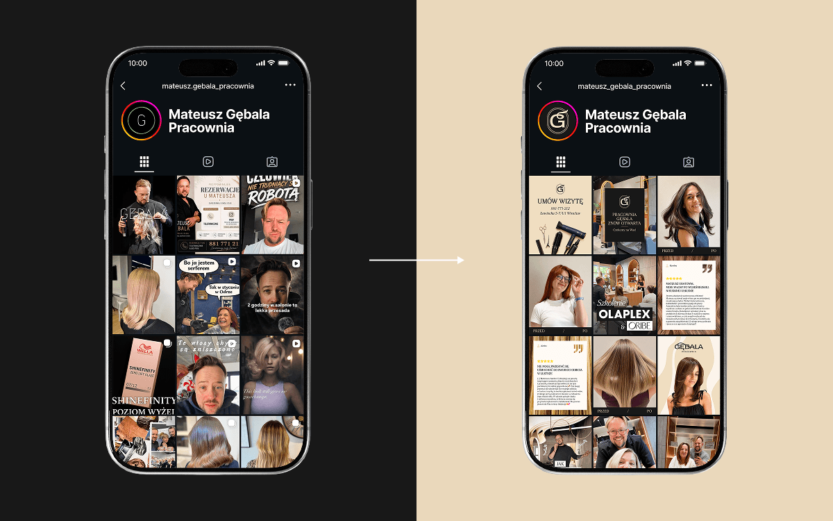
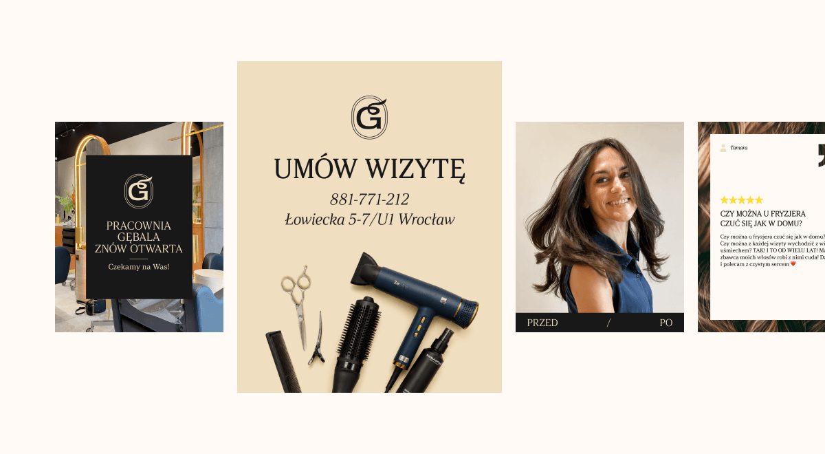
Before we open a design program, we need to know who we are designing for and what we actually want to say. We are interested in the target group, brand values, its character, offer, competition and ambitions for the future. Design should follow from this information, not be created alongside it.
Mateusz's studio operates in two areas at once. On one hand it is a salon for clients from Wrocław and the surrounding area who are looking for a stylist they can trust – especially with modern, advanced colouring. On the other, Mateusz is a Wella Professionals educator and trains hairdressers from all over Poland. The brand therefore had to communicate both experience and expertise, and the quality of service that lets a client feel taken care of – from the haircut to coffee, a drink and something sweet.
This is where strategy starts taking concrete form. The base of the studio's identity became a graphite shade of black, which gave the brand a more exclusive character. We complemented it with a golden beige referring both to the salon's new interior and to the blondes Mateusz specialises in.
For the branding we also chose the Argesta typeface from the Atipo foundry. Its distinctive typography made it possible to build the feeling of a luxurious, sensual brand already at the level of basic elements, while offering a wide range of uses – from the logo and social media, through printed materials, to the future website. On top of that comes one of the main graphic motifs – wavy lines inspired by elements of the salon's new interior. For us they are also a graphic representation of the beautiful, healthy hair we see in Mateusz's work.
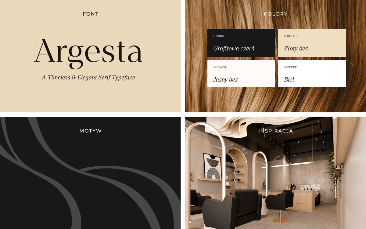
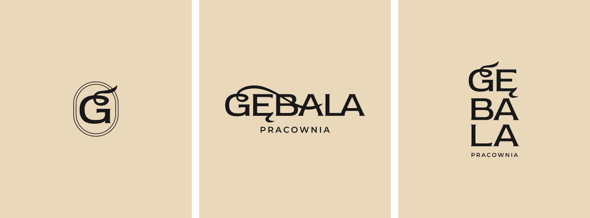
Because design decisions should be backed by more than "we like it". The colour, font, logo form or photography style all have a job to do. They should reach the right audience, evoke the right associations and support the brand's positioning. That is why our logo design didn't start with a search for a flashy mark. We looked for a form that would combine the studio's premium character, its specialisation and the salon's interior. The result is a minimalist logo with a subtle hair motif, and the monogram became especially close to both us and Mateusz – the letter "G" combined with the hair motif and enclosed in an elegant frame.
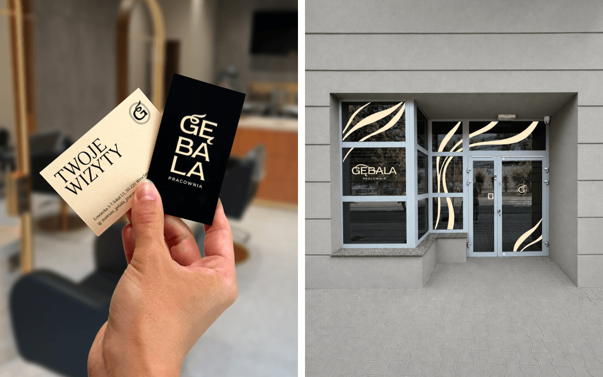
Not necessarily. Sometimes a brand really does need a complete change. Other times it is enough to organise what it already has: define the colour palette, typography, logo usage rules, photography direction and characteristic motifs. That is why, before we propose a brand rebranding, we look at what already works and what is worth keeping. Change for the sake of change is not the goal. In the case of Pracownia Gębala there was no coherent base, so we were able to create it from scratch and think right away about how it would function in different places.
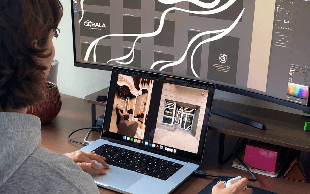
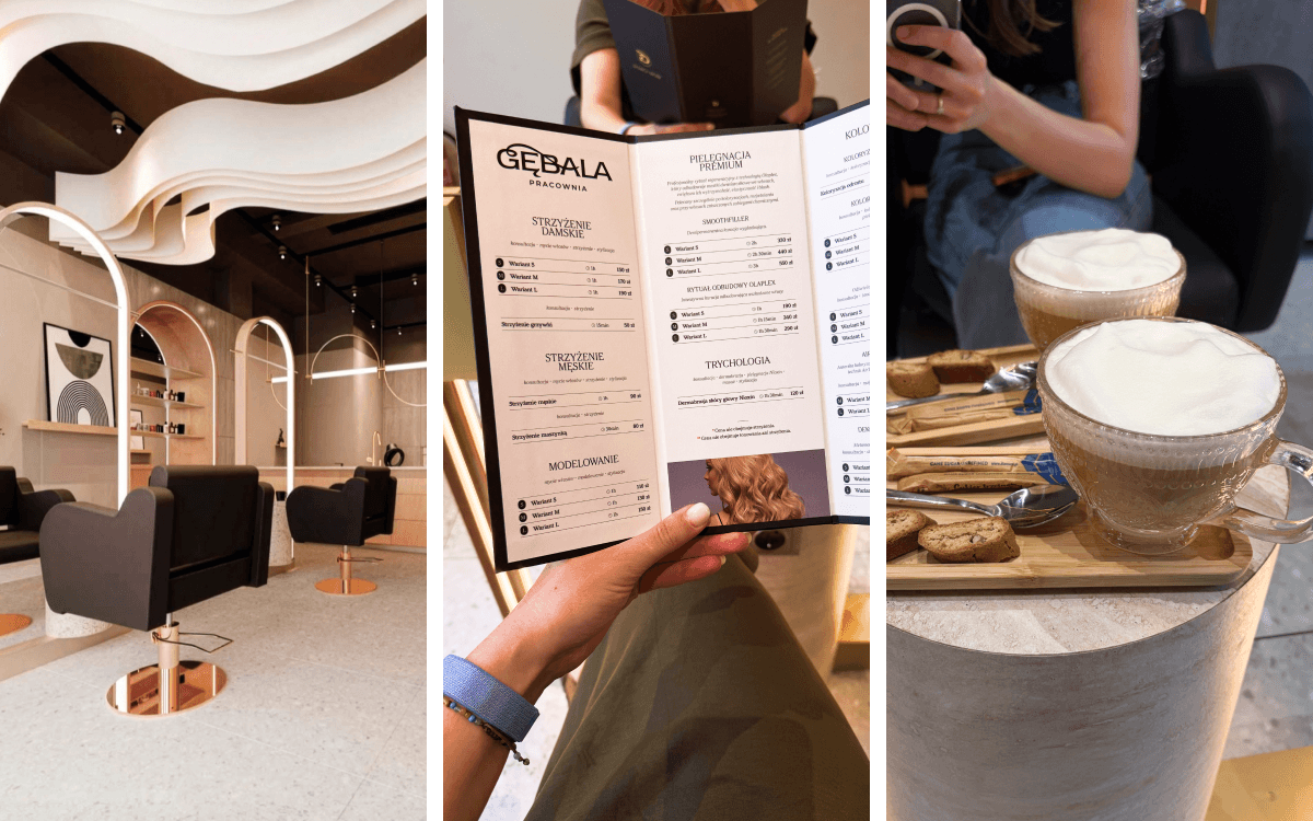
By the fact that the brand starts speaking with one voice. A client sees a reel on Instagram, then the salon's storefront, receives a price list, orders a coffee from the menu and books another appointment – and each of these touchpoints builds the same impression. That is exactly what we cared about at Mateusz Gębala's studio. Not creating a few pretty designs, but building a system that lets the brand be consistently perceived as professional, polished and premium. Because a good corporate visual identity doesn't end with the logo. It begins the moment all the brand's elements start working together.